Shadows and Color Values in Acrylic Painting
A while back, I asked everyone inside my Facebook Group what they wanted to learn more about in acrylic painting. One of the top topics mentioned was how to add depth. Creating dimension in your artwork is done by knowing your light source and adding highlights, and in contrast, using shadows and color values.
* This post may contain affiliate links. If you purchase, I could make a small commission at no charge to you. Please read my Disclaimer and Privacy Policy HERE.
So, I want to talk a little more about shadows and paint color values today.
The best thing for you to do is grab your mixed media pad, a brush, and paints and start practicing! All you need is your favorite color, black and white, to practice your paint color values.
If you want to learn more about creating highlights and shadows with color values, check out my Tree of Life 3-Day Painting Series HERE. I have a whole lesson on the topic where you paint a monochromatic forest!

Materials Mentioned
- Acrylic Craft Paint in Burnt Umber, Nutmeg, White, Pale Yellow, Marsh Green, Christmas Green, and Bright Red
- Mixed Media Pad
- Adi Paint Brush Set
- Color Wheel
- Color Mixing Guide
Knowing Your Light Source
The first thing you need to determine when planning your painting’s composition and where you would be adding shadows is where your light source is coming from; this will help you stay consistent in your placement.
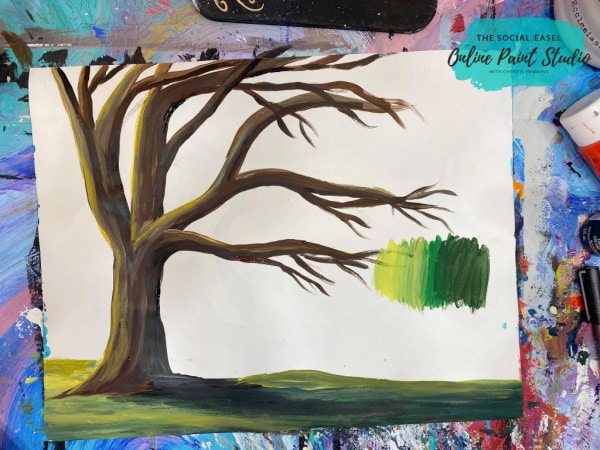
Using Shadows and Color Values on an Old Bare Tree
I had this calendar with a beautiful sunny image of a bare tree in the spring that is a great example of the light source, highlights, shades, and values.
In this image, the sunlight is coming from behind the tree. This means that the trunk facing forward and the ground below is shadowed and dark.
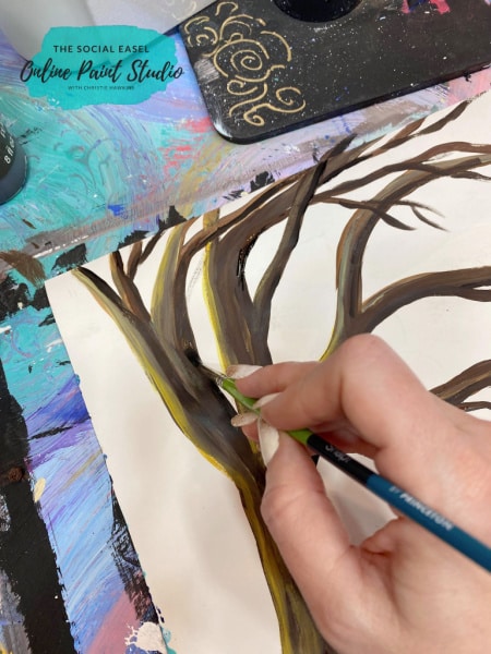
I start with a blend of browns to paint the trunk and branches and keep in mind that I can use less dark brown and even add a little yellow in my paint when working on the top back branch where it catches more light.
With just that color shift, you can see the difference in the lighting of your painting. But this is just the base… wait till you see the transformation as we add more paint layers.
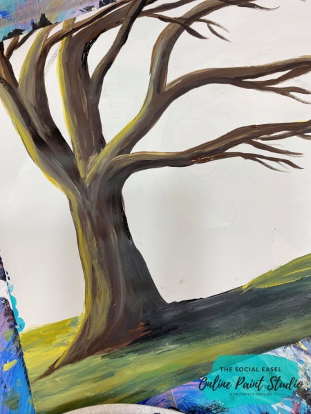
Shade and Highlight
With the sunlight shining from above, you want to paint the branches lighter on the top and darker underneath.
With a dark brown, start shading the underside of the branches. Even the ones that are closest to the light source will have shadows underneath.
While adding shadows, create one on the ground. In my reference photo, it was pretty intense, so I used a very deep tone and mix in green for a mossy look.

You can choose how intense you want your shadows. When the sun is very bright, shadows tend to be darker in contrast, whereas if it’s cloudy out, there isn’t a significant variance.

As the ground gets nearer to the light source, my paint color lightens. You can accentuate that color value change more by adding in yellow.
Take the light color mix to the tree and highlight the top side of the branches facing your light source. Again, you can decide how bold you want these to be.

Take A Step Back From Your Work
In all of your artistic creations, it is a good idea to take a break and come back with a fresh pair of eyes.
One thing I always teach is to take a snapshot of your work in progress and look at that image. Doing this gives you a view in a different light and will help you see what you like and where you might want to make some changes.

When you are up close and personal with your work, especially in this painting style, the strokes can seem very bold. But if you take that step back, you will see the nice contrast of highlights and shadows.
Paint Color Values
You don’t have to use black to create shadows. For instance, I have a mossy green ground, I can pull some dark green into the shadow area to form that dimension. On the flip side of that, you don’t have to lighten with white, like with this old tree painting, I am using a lot of yellow.

One way to darken a color without using black is to use the color opposite on the color wheel. If you don’t have one yet, I think they are pretty handy if you want to learn more about creating your own art. To turn my bright green into a nice darky mossy green color, I mix it with red.

Look at colors like they are on a scale. Using these greens in my example, I can create so many shades of the same color by adding more darkness or lightness. This is the color value. It defines a color in terms of how close it is to white or black.
Grab your Mixed Media Pad and Practice your Shadows and Values while watching Christie
Take your mixed media pad and two colors of paint opposite on the color wheel, and play around to see how many different colors you can come up with to use in a painting.

Learn More about Color Mixing HERE
Maybe challenge yourself to create your dark values and try not to use black in a painting. I would love to know what you learned and see what you make!
